

 |
||||||||||||||
|
WebSite redesign and facelifts / Revamps
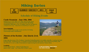
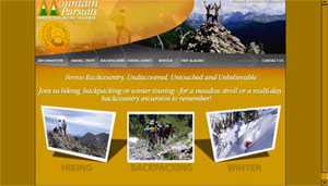
What is a website facelift? What we do is take your present site and use what you have, and then create a much better version with the newest scripts compatible for most browsers and the newest advertising techniques. Usually because you have a website built already, we can do more copying and pasting which saves you money because we have to do less typing. So on average, website facelifts and redesigns are quite affordable and a great way to make your site more graphically pleasing but yet still search engine friendly. Feel free at any time to request a website facelift in our quote section. Here is an example of a redesign.
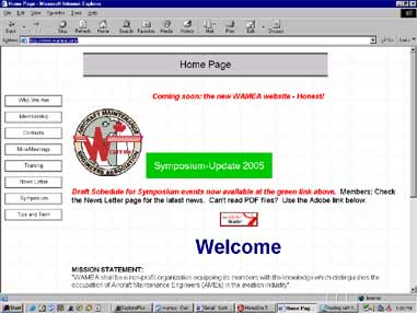
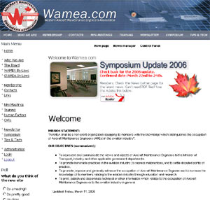
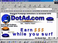
A number of concerns should be dealt with when facelifting web pages. The Frynge will provide you will a professional look, and we pride ourselves in giving our clients custom designed updated websites, that work on all browsers. Wamea above is a great example of how we can redesign your website. With this job, we converted his site over to CMS (content management system) allows you to change your pages, and also updated with a static graphical banner and better graphics all around. This can give a better look to your website. The problem page on the left was Dotad's first try. They had built it in Microsoft FrontPage. They had numerous problems. One problem was that because they had built the website in frontpage, browsers such as netscape or mozilla based browsers wouldn't work correctly. The buttons or special scripts they had made in frontpage, they are custom, but wouldn't work on other browsers. No Netscape, Webtv, or mozilla based browsers could view the animations as well as AOL users and Unix users. It crashed Netscape browsers and in others, it did not display correctly. Netscape still holds a small portion of the market share and so they asked the Frynge to fix it up. The second problem was the animations were all in FrontPage, so when you tried to click on a button, it didn't go anywhere. This was solved by using animated gifs and using JavaScript. And the third problem on the website, was that the page scrolled off to the right effectively hiding a portion of their web page from users that didn't know to scroll over to the right. They started building their page in 800x600 resolution and it was fixed easily by building all of the page in 640x480. It then looks a little smaller in other resolutions but does not change. This is why they chose to facelift their pages. Notice how the version on the right, does not have a little scroll bar at the bottom. The graphics change by JavaScript (more supported then front page) and the animations are done in GIF graphics not FrontPage and is not professional. You can be assured that the Frynge.com will use the latest technology (using CSS, CMS, DHTML, FLASH etc) and will take in to account, how you want your site to view to your clients, not only how it displays on your computer. Feel free to request a quote, to update your site with the latest advertising techniques or graphical / scripting. Some other redesigns...
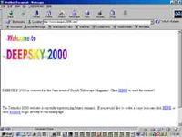
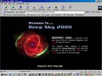
Deepsky is a great facelift. They have ecommerce, flash graphics, google adwords, great forums and a great product to boot. Steve Tuma constantly keeps his website updated and is always asking to facelift some area to keep his content and graphics fresh. We took his site originally out of frames, added flash banners, added a custom forum, and made alot of great graphics all around his website. His original site had many problems and its obvious his sales are having a steady increase over the years. The outside of your business is like your first impression on a date. If you make a bad one right off the bat, this may be your only chance to sell a product and or service. So check out our quote section and request a quote to revamp your site today. |
||||||||||||||
